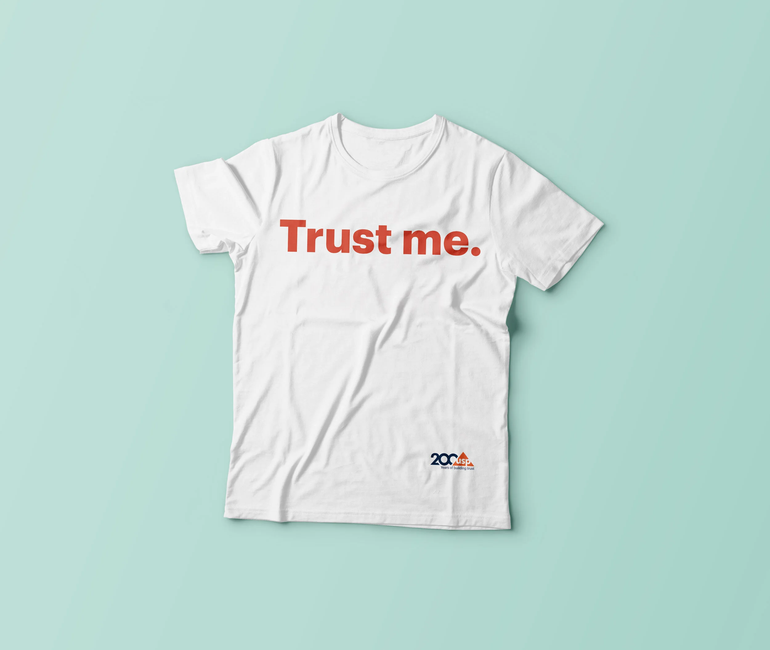
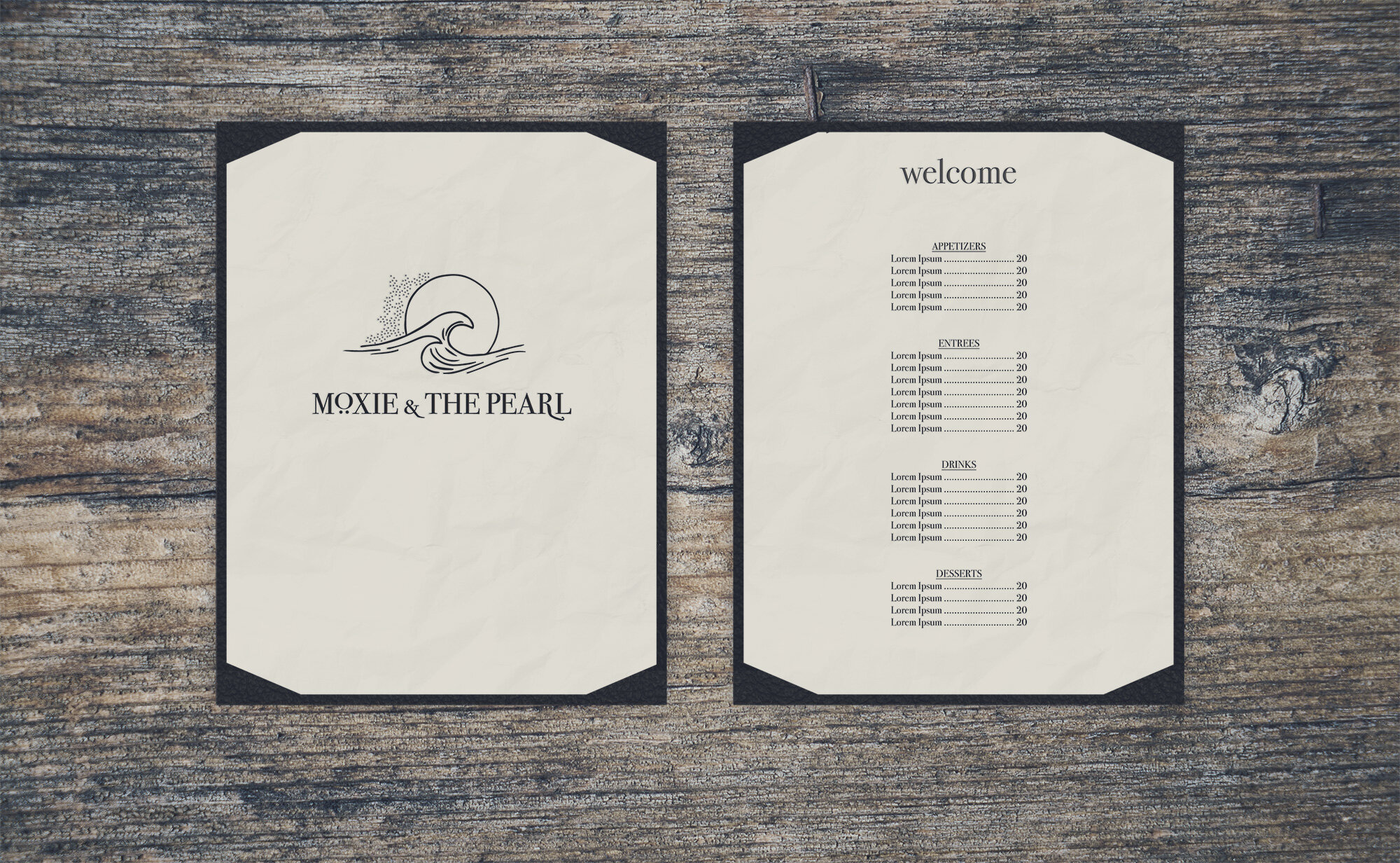
Selected Work
The Farm: Bill Davies, a local entrepreneur and food guy approached us for the creation of an identity for his new gourmet market opening in Belmont. Our aim was to create a logo that was rustic, fresh, and fit in with the artistic community of Belmont. Bill had Edward Pelton create the metal signage on the front of the building.
Pelton Metalworks: Edward Pelton, a talented and experienced blacksmith in Charlottesville, came to us seeking a clean, yet masculine identity. The rugged P in the logo was derived from the shape of an anvil. We also put together a collection of marketing materials that showcased his amazing abilities.
Mona Lisa Pasta: Mona Lisa Pasta asked us to take on the challenge of rebranding their logo, packaging, and interior space. We decided to take the brand in a refreshing new direction that was contemporary and exciting. The design is clean and the palette was kept simple for a cohesive package and labeling system.
Jump Mountain Vineyard: Mary and David came to us soon after starting their vineyard out in Rockbridge Baths, Virginia. This rural vineyard needed to appeal to the local population as well as the weekend crowd. We created a rustic and approachable brand and label that highlighted the shape of Jump Mountain itself.
Jefferson-Madison Regional Library: William Culpepper, Alicia DeHart, Marie Schacht, and myself were teamed up with the Jefferson-Madison Regional Library for the 2009 Design Marathon. Our challenge was to come up with a new identity, library card, and a brochure in the 12 hour time period. Grow. Learn. Connect. became our tagline and starting point for a tri-color card system.
Belle Grove Plantation: This National Historic Plantation needed a drastic rebranding. The new website had to serve as the main resource for event information and ticketing. Karen Thomas from Padstow Designs helped on the development of this project.
JohnSarahJohn: John Gibson, Sarah Owen and John Owen were starting a new business venture and needed an identity, business card and website that complimented their unique aesthetic. The letters from their name allowed for a symmetric monogram. The web site needed to feel rich with texture to reflect their own work.
Danger. Zombies. Run. The philosophical zombie comedy by Brian Wimer was a super exciting project to work on. Not only did we get to create all of the marketing materials for the movie, we also got to be part of the first annual Danger. Zombies. 5K Run. that took place right here in Charlottesville.
Effecuate: We were contacted by some folks at the Darden School of Business to create an identity and website around a hot topic in the entrepreneurial world, Effectuation. Since the methodology is based off of five key principles, we wanted our logo concept to coincide with that. Illustrations were also created to bring a visual element to the site and materials.
Wilco: We don't seem to get tired of designing concert posters for one of our all time favorite bands, Wilco. Here are a couple new posters from last year's tour, as well as the classic Wilco Skyline Poster from 2005.
Pure Renewables: Nick Procter from Zumzing commissioned us to do some illustrations for a website he was developing for a UK energy consulting firm. The goal was to create informative and interesting looking illustrations that would bring insight and balance to the technical topics.
